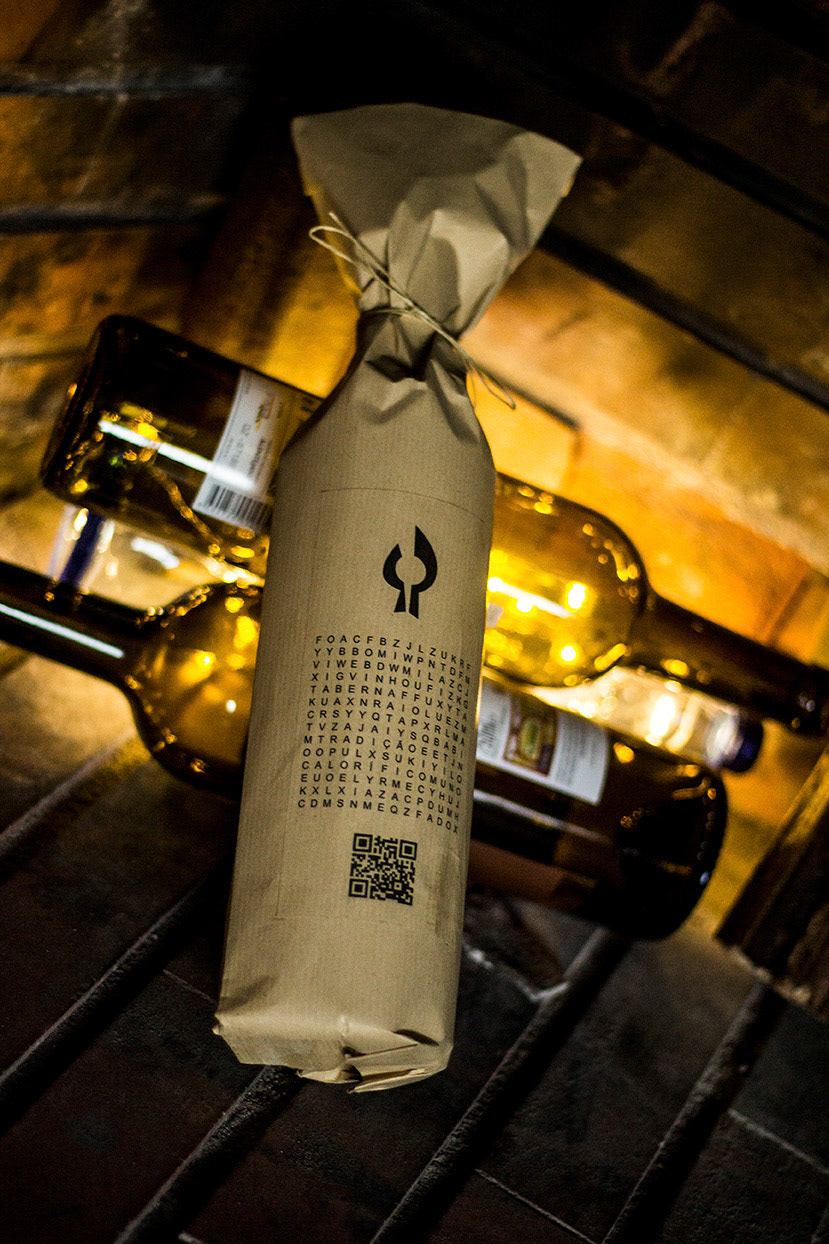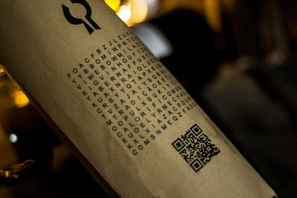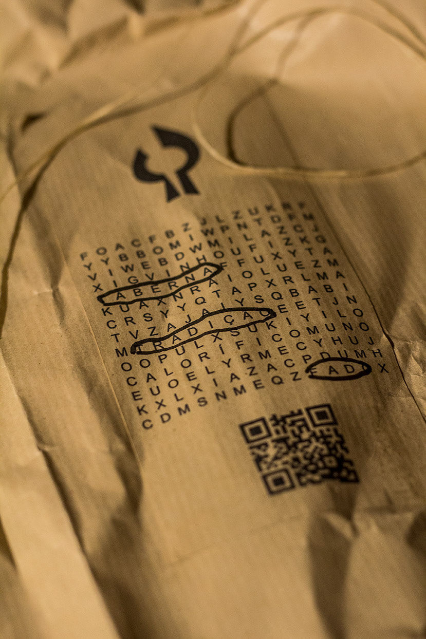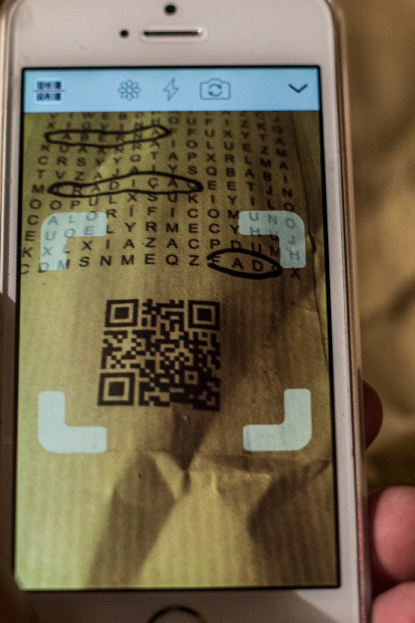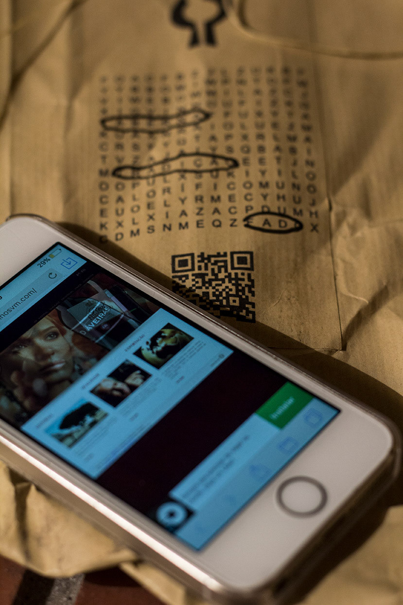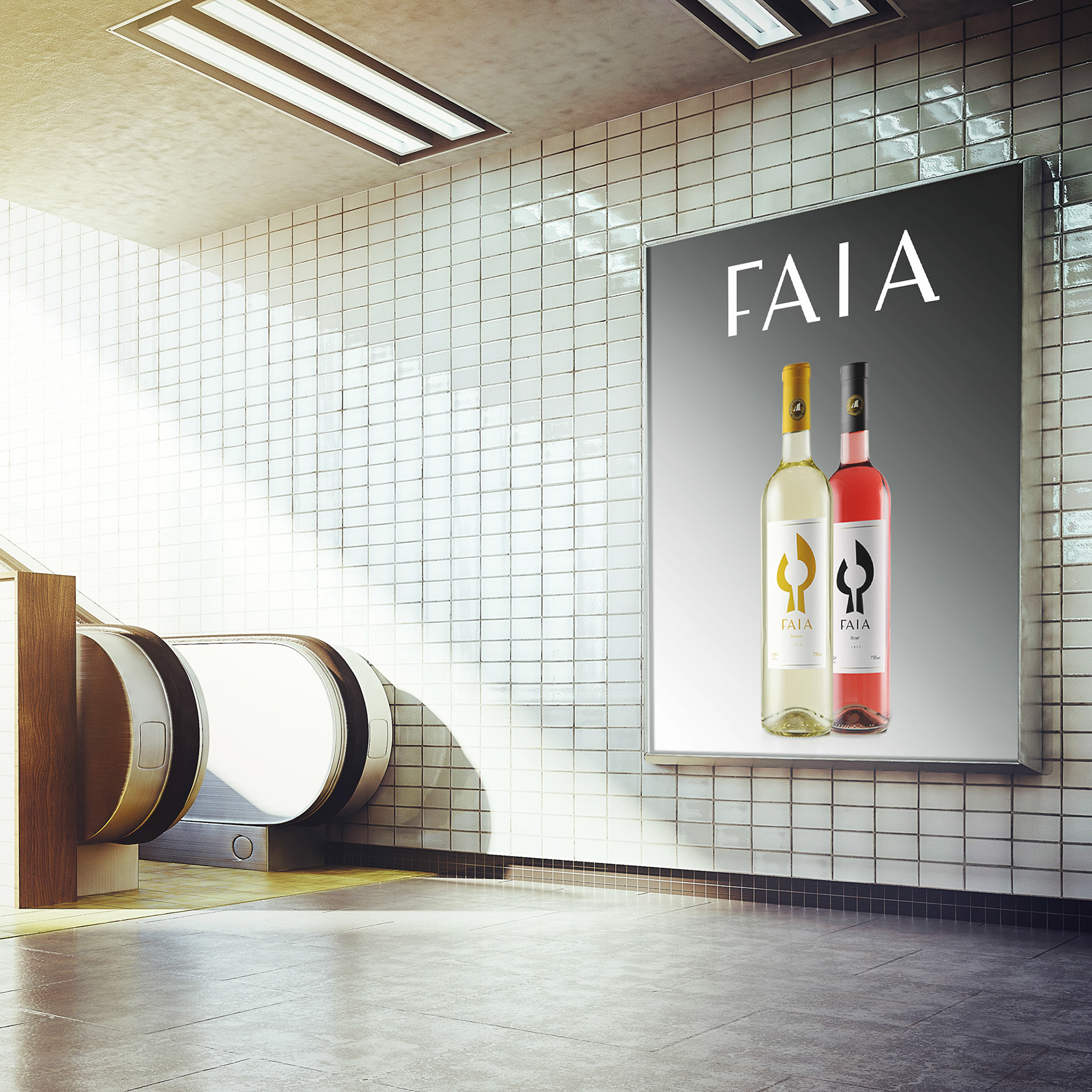


As part of a branding course, I undertook a rebranding project for Faia wine. Faia is a well-known Portuguese wine brand with a rich heritage, but its image needed an update. Drawing inspiration from the brand’s name, which refers to a tree that grows in Portugal, I created a new logo that combines the shape of a tree, its fruit, and a Portuguese guitar, embodying the traditional values of the brand. To complete the rebranding, I proposed packaging made from recycled paper, adorned with crosswords that emphasize the value of the paper itself, rather than seeing it as waste. The crosswords also serve as a playful way to gather with family and friends, aligning with the values of conviviality and tradition that are essential to any wine company. A+
